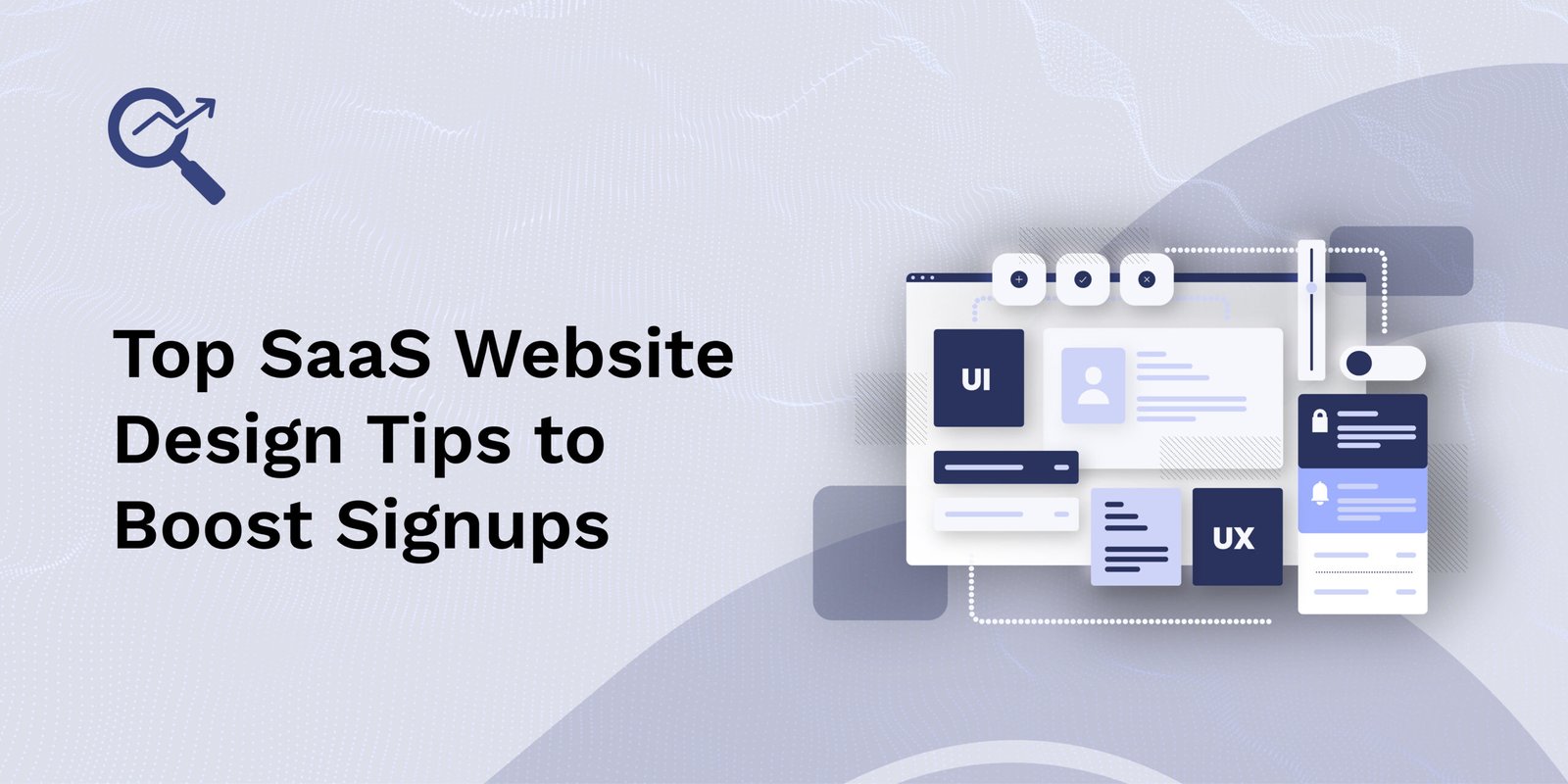
In the competitive world of Software as a Service (SaaS), your website is not just a digital presence; it’s your best salesperson. It needs to grab attention, earn trust, and guide visitors to take action—mainly, to sign up. A well-designed SaaS website can significantly increase conversions and reduce bounce rates. Let’s dive into the most effective SaaS website design tips to boost signups.
Importance of Website Design in SaaS Success
- First Impressions Matter
A professional, visually appealing design builds trust instantly and encourages visitors to explore your product further. - User Experience (UX)
Intuitive navigation, fast loading speeds, and responsive design ensure users can easily access information, leading to higher engagement and lower bounce rates. - Clear Value Proposition
A good design highlights the product’s benefits and features in a clear, compelling way, helping users understand its value quickly. - Conversion Optimization
Strategic placement of CTAs (calls-to-action), testimonials, and product demos guide users smoothly through the buyer journey, boosting sign-ups. - Brand Identity
Consistent branding elements like color schemes, typography, and visuals reinforce brand recognition and trust. - SEO and Accessibility
A well-structured website with optimized content improves search engine rankings and ensures usability for all users, including those with disabilities.
Top SaaS Website Design Tips
Here are the essential SaaS website design tips to help you optimize your site for growth, usability, and clarity:
1. Know Your Ideal Customer Inside Out
Before you open a design tool or start sketching wireframes, you must understand your audience deeply.
- Why this matters: Design decisions, tone of voice, and calls-to-action (CTAs) should all be built around the person you’re trying to attract.
How to do it:
- Identify your customers’ biggest pain points.
- Understand what outcomes they’re searching for.
- Discover what language they use and what tone resonates with them (casual, professional, technical, etc.).
- Build buyer personas that outline:
- Job role
- Goals and motivations
- Daily challenges
- Preferred communication channels
Tip: Keep personas visible for your team. Revisit them when writing copy, designing flows, or building features.
2. Craft a Clear and Powerful Value Proposition
A visitor should know within seconds what you do and why it matters.
What makes a great value proposition:
- 1–2 clear lines
- Focuses on benefits, not features
- Shows your unique advantage
Example:
“Manage complex projects in half the time—our AI-powered platform was built for remote teams.”
Placement: Always position this in your hero section, front and center.
3. Use an Effective Hero Section
Your hero section is the most viewed part of your site—it must captivate and convert.
Include:
- A bold value proposition (headline + subheadline)
- A relevant image or animation
- A strong CTA like “Start Free Trial” or “Book a Demo”
Design tips:
- Use whitespace to emphasize your message.
- Avoid clutter and distraction.
- Ensure the hero section looks great on both desktop and mobile.
4. Design for Conversion, Not Just Aesthetics
Design isn’t about “looking pretty.” It should guide the user toward action.
Best practices:
- Use directional cues (arrows, person’s gaze in images).
- Stick to one primary CTA per page.
- Use contrasting colors for CTA buttons.
- Minimize noise—fewer elements mean clearer choices.
Goal: Make it easy and irresistible to sign up.
5. Make CTAs Stand Out and Consistent
Call-to-action buttons are your digital salespeople. Treat them accordingly.
How to optimize CTAs:
- Place key CTAs above the fold.
- Use action-driven text: “Get Started,” “Try It Free,” “Schedule a Demo.”
- Repeat CTAs throughout the page to catch users who scroll.
Why it works: Consistency builds trust. Your users shouldn’t wonder what to do next.
6. Leverage Social Proof to Build Trust
Trust is the currency of the internet. Show that others believe in your product.
Include:
- Testimonials with real names and photos
- Logos of well-known clients or partners
- Short case studies or success metrics
- User reviews from platforms like G2, Capterra, or Trustpilot
Pro tip: Feature results (“increased conversion by 42%”) whenever possible.
7. Show, Don’t Just Tell
Instead of explaining your product in text alone, show it in action.
Use:
- Product screenshots
- Gifs of workflows or features
- UI mockups on devices
- Explainer or demo videos
Why it matters: Visual content increases comprehension and builds trust faster than paragraphs of text.
8. Keep Navigation Simple and Focused
Cluttered navigation confuses visitors and increases bounce rates.
Navigation tips:
- Limit menu items to essentials (e.g., Features, Pricing, Demo, Contact).
- Highlight your CTA in the top right (a tried-and-true pattern).
- Avoid complex dropdowns—especially on mobile.
Bonus: Simple menus are more accessible and easier to maintain.
9. Optimize the Signup Flow
Once users click “Sign Up,” your job isn’t done—you must convert them smoothly.
To optimize signup:
- Keep forms short (only ask for essential info).
- Use progress indicators if multi-step.
- Minimize friction and distractions.
- Reinforce value: “Start your 30-day free trial—no credit card required.”
Consider: Progressive profiling—ask for more data only after initial signup.
10. Highlight Features by Benefits
People don’t buy software—they buy solutions to their problems.
How to write feature sections:
- Group features under benefit-driven headers.
- Explain how each feature solves a pain point.
Instead of:
“Calendar integration”
Try:
“Never miss a deadline again—our calendar syncs with your favorite tools.”
11. Speed and Mobile Responsiveness Are Non-Negotiable
A slow or broken site kills conversions and trust.
Optimize for:
- Page load speed under 2 seconds
- Responsive design that adapts to all screen sizes
- Clean and efficient code
Tools to help:
- Google PageSpeed Insights
- GTmetrix
- Hotjar for real-user feedback
12. Use Pricing Pages to Drive Action
Pricing pages are often where the conversion happens—or dies.
Design tips:
- Make pricing tables easy to scan.
- Highlight your most popular or best value plan.
- Use toggle switches for monthly vs. annual billing.
- Add FAQs to answer objections.
- Reinforce value with testimonials or feature callouts.
13. Incorporate Live Chat and Chatbots
Not every visitor will convert without a nudge. Live chat provides real-time reassurance.
Benefits:
- Answer questions instantly
- Reduce bounce from confused visitors
- Help guide users to the right plan
Important: Ensure bots are helpful, not intrusive. Offer easy opt-outs.
14. A/B Test Your Way to Better Conversions
Don’t guess what works—test it.
A/B test elements like:
- Hero headlines
- Button copy (“Free Trial” vs. “Get Started”)
- Colors and placement of CTAs
- Form lengths and field labels
Tools to try:
- Google Optimize
- Optimizely
- VWO
Goal: Use data, not opinion, to iterate your design.
15. Create Content That Educates and Converts
Blogs and resource centers attract traffic and build authority.
Effective SaaS content strategy:
- Address user pain points in articles
- Use lead magnets (e.g., whitepapers, checklists)
- Link to your product and include in-content CTAs
- Target SEO keywords relevant to your niche
Remember: Great content is a long-term engine for trust and traffic.
16. Build a Landing Page for Every Campaign
Sending paid traffic to your homepage is a missed opportunity.
Instead:
- Create dedicated landing pages for each ad, email, or campaign.
- Match the page content and design to the message that brought users there.
- Focus each landing page on one goal—signup, demo, or download.
Why it works: Consistency increases conversions.
17. Use Trust Signals Throughout
Beyond testimonials, reinforce safety and credibility everywhere.
Key trust signals:
- SSL certificates (secure lock in browser)
- GDPR and data privacy compliance badges
- Money-back guarantees
- Transparent refund or cancellation policies
Placement: Add these in the footer, pricing sections, and forms.
18. Add Microcopy That Reassures
Small bits of text can remove big fears.
Examples of smart microcopy:
- Next to email fields: “We never share your email.”
- Under CTA buttons: “No credit card required.”
- On pricing pages: “Cancel anytime, hassle-free.”
Why it helps: Microcopy reduces friction by easing subconscious objections.
19. Design with Accessibility in Mind
Accessible design doesn’t just help users with disabilities—it improves overall usability.
Best practices:
- Ensure high color contrast for text
- Add alt-text to all images
- Support keyboard navigation
- Let users increase font size
- Avoid flashing or distracting animations
Bonus: Accessibility can improve your SEO and brand reputation.
20. Add Exit-Intent Popups Smartly
If someone’s about to leave, a well-timed offer might save the conversion.
Ideas for exit-intent popups:
- Offer a 10% discount
- Provide a helpful resource (e.g., comparison guide)
- Ask “What’s stopping you from signing up?”
Important: Keep it polite, skippable, and not annoying. Use sparingly.
🔗 Looking to Turn Your High-Converting Design into Real Growth?
While design plays a critical role in getting visitors to sign up, what happens before they land on your website is just as important. From SEO and paid ads to positioning and messaging—smart SaaS marketing drives qualified traffic to your high-converting pages.
👉 Dive deeper into SaaS Marketing strategies that fuel growth and learn how to align your design efforts with a powerful marketing plan.
Final Thoughts
Your SaaS website is your frontline salesperson. Every design choice either brings someone closer to signing up or pushes them away. Focus on clarity, trust, speed, and simplicity.
Remember: The goal is not just to impress but to convert.
By implementing these SaaS website design tips, you’ll create a frictionless experience that encourages visitors to take action. In a market full of noise, clarity and smart design are your ultimate conversion tools.


